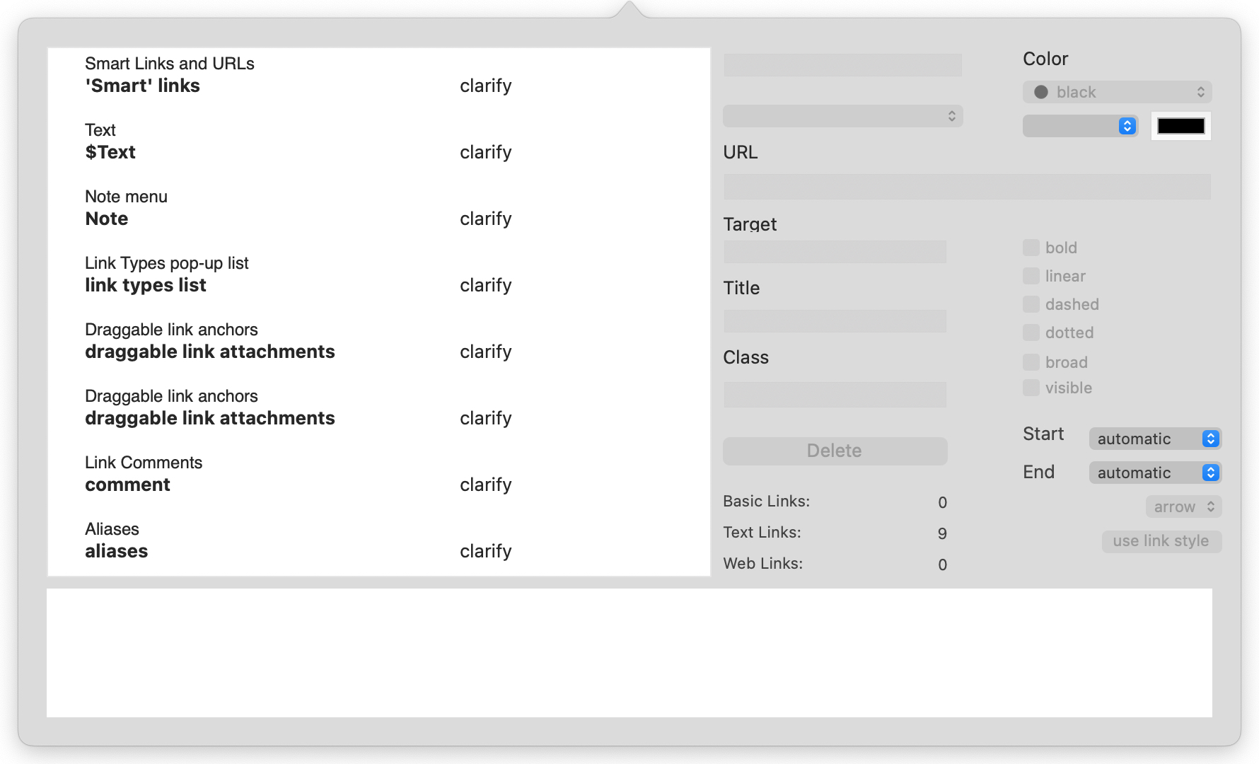
The Browse Links pop-over shows all the links originating from the currently selected note (with the exception of 'Smart' links) and offers the ability to edit their details. This pop-over cannot be 'torn off' so is effectively a modal dialog. For every link originating from the selected note, the left-hand listing shows:
- The display name of the destination note, or '(web link)' for web links from $Text.
- The anchor text in $Text (text links only).
- The link type (bottom right).
- Mouseover (either link destination or anchor text) shows the full path ($Path) of the destination note.
Any link selected in the list has its details shown in the lower panel.
Links may be dragged to reorder them. This is useful to set the 'first' link in the list, as used by the 'Navigate' feature in the Note menu.
All basic links list before all web links and then all text links. Text links are listed in order of text offset, i.e. where they occur in the flow of text. Thus the first text link in $Text links first. This makes finding the correct link much easier in a well-linked page's listing. Links to or from aliases are shown in italics.
Double-click any link to select its destination and dismiss the popover. If invoked from a view pane, the view will be scrolled or refocused if necessary to locate the newly-selected note. For to-text links this scrolls the destination note to the link point and highlights the linked word.
When a text link is selected the text pane scrolls to make the link anchor visible and the link anchor is temporarily highlighted.
The middle column of controls are the same as for creating links:
- link type list. Pick a link type (or none) from the pop-up link types list. To create a new link type, first use the Links Inspector to add the new type to the list. This field is disabled when no link is selected, but otherwise lets a link type value be typed to select it, or to create a new link type (without having to define it first). Changing the link type here now fires the link's OnLink action, if any.
- URL. The destination URL for the link, either for import or display in a browser. This can in fact be FTP, mailto or various other online URL protocols.
- Target. The name of the window to use. Pertinent for framed web sites, or if you wish the exported HTML to call the link in a separate window. You do not see these names but your browser does and if the window cited is already open, then that window is re-used. An easy method for naming the 'target' is to always use the value 'tbx'. As it is unlikely another application will spawn a window called 'tbx' only your Tinderbox site's external links will share a second common window.
- Title. This sets the link's HTML 'title' attribute which may (depending on browser) type be shown in a status bar or mouse-over of HTML.
- Class. The name of a CSS style sheet class to be applied to the link when in HTML form. This is useful if you would like different link types (or just arbitrary collections of links) to have different web styling.
- Delete button. Deletes the currently selected link.
The right column of controls allow most aspects of this particular link to be customised. Only the link label text, label visibility and link line visibility apply to all links of a given type. The controls are:
- Color. Standard trio of controls for colour: a pop-up list of defined colours, a colour shade pop-up and a colour chip control.
- line style tick-boxes. Dashed and dotted can be combined to give a dot-dash-dot style of line.
- link terminator list. The shape used at the destination end of the link. The current choices are 'arrow' (default) or 'circle'.
- link start position. Click the pop-up to set from which map icon face (automatic/top/right/bottom/left) the link is drawn. Default is automatic. See more on draggable link attachments.
- link termination position. Click the pop-up to set at which map icon face (automatic/top/right/bottom/left) the link is terminated. Default is automatic. See more on draggable link attachments.
- use link style button. Clicking this button resets the above controls to the defaults for the overall link, i.e. removing per-link customisation.
- visibility tick-box. Link visibility can be controlled for individual links as well as through link types. If a link type is not visible, all links of that type are hidden. If a link type is visible, then individual links may be hidden or shown.
- link comment box. If the selected link has a comment, it can be viewed or edited in this box.
Note that aliases can support their own outbound basic links ($Text links are shared with the original). In such a case, the link listing of the Browse Links may differ when open from the alias or from the original.
To dismiss the pop-over, click anywhere outside the pop-over.
To view a note's links when a note no longer has focus, open its Roadmap and tear-off the pop-up as a stand-alone window (that will last for the rest of the current session).
See also—notes linking to here:
