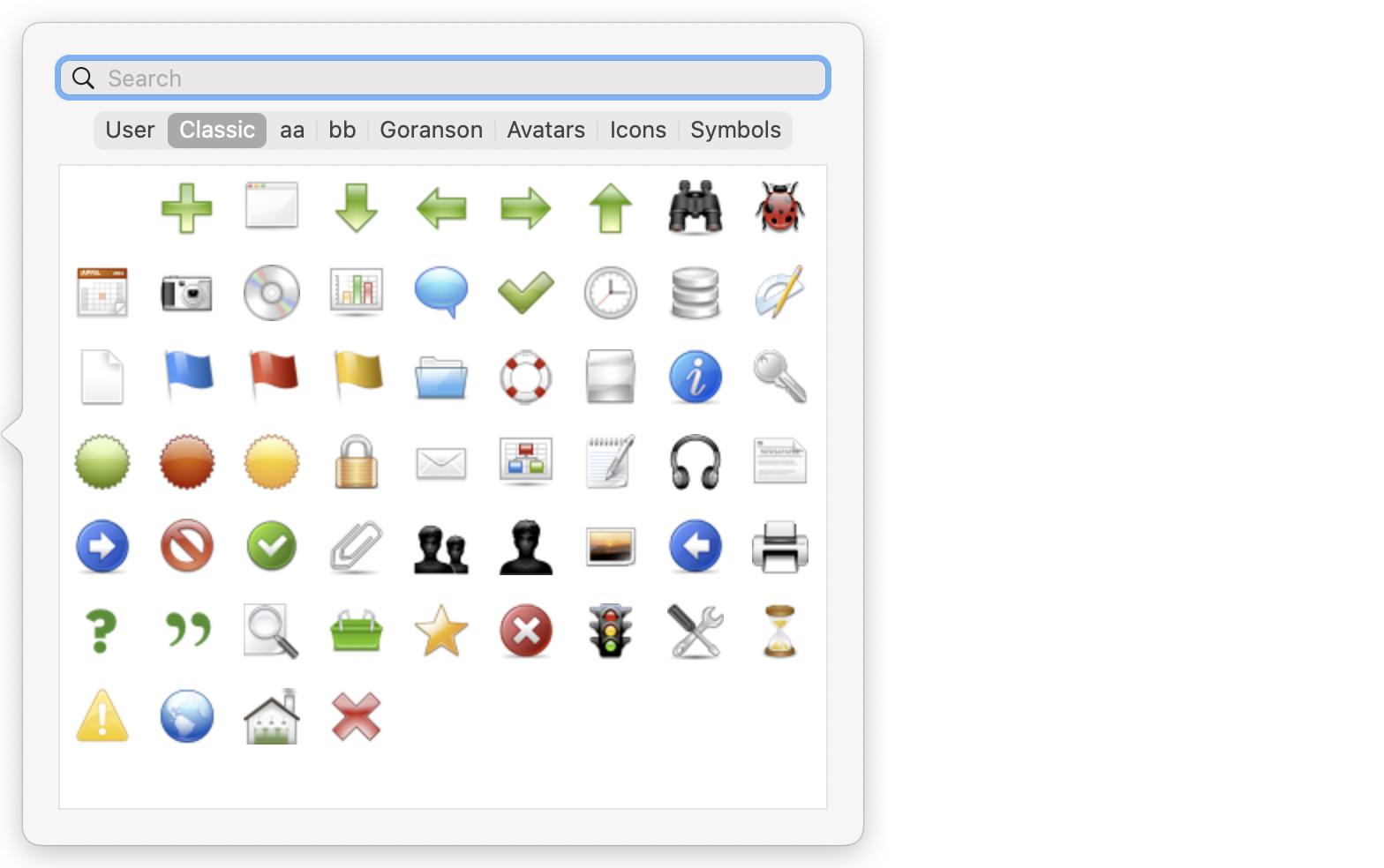
 Called from the badge control of main pane note icons, this picker gives a visual picker for available badges. The badge selection is stored, via its string name, in $Badge.
The Badge Picker offers a Search field. When using the search field, Tinderbox displays badges from any family that match the string typed in the search field. Clear the search field to view badges by family. In addition to matching the name of the badge, the picker also searches for words semantically related to the searched-for (English) word. Thus, searching for "flight" will locate the badge "airplane".
The range of badges shown depends on the built-in sets and any added by the user. The pickers tabs are (left to right):
- User. Any custom badge artwork placed directly into the 'badges' folder within Tinderbox's application support folder.
- Classic. The primary set of badges (default tab selection)
- Avatars. Built-in set.
- Icons. Built-in set.
- Symbols. Built-in set.
- User folders… Any discrete folders of custom badges placed into the 'badges' folder within Tinderbox's application support folder. The tab name is the folder name.
Click on any badge to set the note's $Badge. Clicking the first (blank) tile in any set resets the Badge to the default inherited state.
Place the mouse cursor over any icon, without clicking, and after a brief pause the icon's name is shown as a tool-tip. Names are case-sensitive and all built-in badges use all-lowercase.
To close the pop-over click anywhere outside it.
The Badge Picker adopts the prevailing background colour in dark mode. Monochrome icon families are drawn in white over a dark background, and in black over a light background; colour families are drawn normally.
Using system font symbols
If built-in or custom selections of badges do not suffice, it is possible to use Badges from the macOS 'SF Symbols' font. The latter has been part of macOS since OS 11, and subsequent releases have added to the range of symbols In the font. The overall symbol set is so large that they cannot all be easily displayed in the Badge picker, but if searching for icons, items matched from SF Symbols are displayed in the 'Symbols' sub-pane (see above) of the badge-picker pop-over.
These system symbols often use a dot chained naming syntax. For instance, the 'star.leadinghalf.filled' is a star shape, with its left side having a solid fill. So when searching, using 'star.' might be a better scoping of the search than 'star' (without the trailing period).
To use an SF Symbols icon either:
- click the desired badge in the Badge picker pop-over after doing a search
- set the desired icon name applying the prefix 'sf-', thus SF Symbols icon 'star.leadinghalf.filled' is set as a $Badge value (e.g. via action code or paste) as
sf-star.leadinghalf.filled.
See also—notes linking to here:
