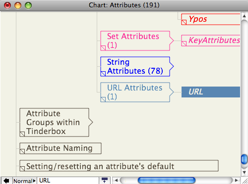
A chart view shows the hierarchical structure of the document very clearly, as a tree chart. A chart is also handy for seeing many notes in one window. It is easy to re-structure the hierarchy of the document in a chart window, by dragging parts of the hierarchy to other parts of the hierarchy. The scope of the chart depends on the selection when the chart view is called. If in root view and nothing is selected, the chart is of the entire outline, otherwise it is of the selected item and al its descendants.
A note icon with a pointed right end is a container. By default a new chart is drawn with all branches expanded. However, any container note can be collapsed (like with an Outline) by clicking the triangular area at the right edge of container icons.
A chart view does not show any of the links in the document. A chart view doesn't differentiate between notes and agents as in outline or map view (through if a container holds only aliases, it is most likely an agent). Chart view dog-ears do not show the ageing colour (as in outline view, etc.).
Charts can wrap their titles to multiple lines and editing-in-place is supported.
The note's dogear is drawn bottom left of the note icon.
From v5.8.0, the note's badge is shown to the left of the title. Right-clicking in this area opens the badge menu.
When selected, a note is drawn Map-style with a $Color background and title in $NameColor. When unselected, the note title and border are drawn in $Color.
Chart view is not suitable for very large outlines, e.g. the whole of a document such as aTbRef, so avoid using this view for very large numbers of notes. This is because Tinderbox runs out of virtual space in which to draw the overall outline (i.e. it's an under the hood limit). Reserve chart use for small files or just sections of larger files. Large charts can take a long time to render and may not scroll smoothly due to their sheer size (N.B. outlines are more compact).