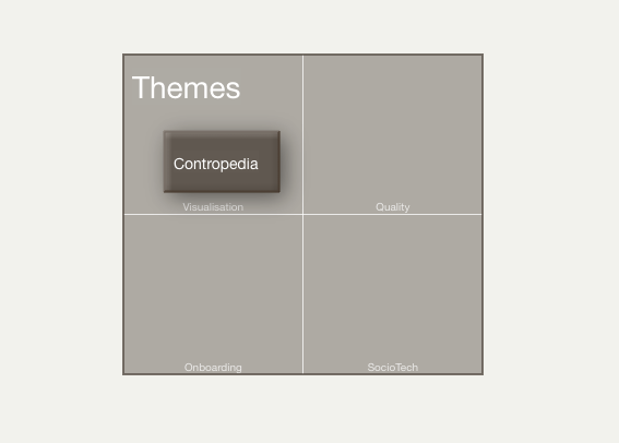
 Adornment grids allow an optional gridded framework to be drawn into an adornment as background markup to any notes being arranged atop the adornment. The grid is most easily configured by clicking the 2x3 grid icon which opens the Grid Properties pop-over.
The number of cells in the gird are controlled via $GridRows and $GridColumns. The cells can each be given a label via $GridLabels, which are drawn in $GridLabelFont at $GridLabelSize. The overall grid and labels are drawn in $GridColor and with $GridOpacity.
All these adjustments can be accessed via the Grid Properties pop-over which is accessed by the grid icon on any currently selected adornment.
The image shows a 2 row, 2 column grid with labelled cells; all other settings are default. Transparent adornments may draw a border and grids.
The use of a grid does not affect the OnAdd action of the adornment, which applies to a note regardless of where on the grid it is placed.
The placement of notes by a smart adornment is not aware of a grid. The smart process will use the adornment as a whole, ignoring grid assignments. Therefore grids are not ideally used with smart adornments.
The grid icon is not displayed when the adornment is part of a multiple selection.
From v10.2.0, adornments using an "oval" shape ($Shape) use a different layou—see below.
See also—notes linking to here:
