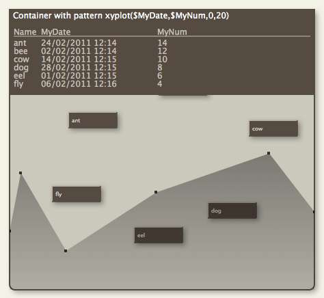
A pattern that applies only to containers (notes & agents), is plot(). It evaluates an expression using data from each child of the containers to produce a graph; i.e the scope is always a group, specifically 'child'.
The graph, in the forms of a sparkline-type plot is drawn across the viewport area of the container. The graph is drawn in colour $PlotColor. The container viewport is still accessible for drag/drop, etc., as if the plot were not there: think of the plot as an overlay.
For example, to graph the word count of each child note in the container, see the container's map Pattern attribute to use plot():
plot($WordCount)
An alternate plot type is bargraph(), which draws a bar graph of each child item's value.
bargraph($WordCount)
A further option is xyplot(), which offers a double variable plot:
xyplot($Date,$Price)
The pie() plot gives a pie graph based on an attribute (or expression):
pie($EditsMade)
The ring() plot displays an arc representing 70% of a complete circle. The circle is always drawn centred on a 9-o'clock position; a 50% completion would fill from 6 through 9 to 12.
ring(70)
All plot operators accept optional minimum & maximum values, e.g. plot($Attribute,min_num,max_num). Thus:
bargraph($WordCount,0)
graphs the word count of each note whilst ensuring the Y-axis is based at zero, with all attribute values including the maximum being plotted. Note that while zero is the default value of an 'blank' number type attribute, the type allows minus values. The above example would treat all of them as if their value were zero. If a negative min value is supplied, negative item values above that threshold are plotted. The above example would treat all of them as if their value were zero. For:
plot($WordCount,10,900)
the plot graphs the data from a baseline of 10 to a maximum value of 900. Values outside these are plotted appropriately as the min or max values.
The plot/bargraph patterns are ignored if applied to non-container notes.
A container can also apply the bar & vbar progress bar patterns as used with note icons. However, as both types of visualisation use the $Pattern attribute it is not possible to use a progress bar and plot at the same time.
Where a container plot is applied, Before the graph is drawn, the space behind the plot is filled with the colour $PlotBackgroundColor with opacity of $PlotBackgroundOpacity. Previously the background was that of the child map.
