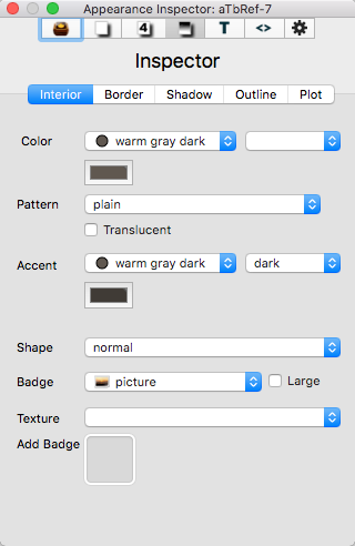
This gives easy access for setting a number of appearance-related attributes of notes. The results are applied to all selected note(s).
Color. There are 3 'standard' colour controls that set $Color:
- Defined colour list pop-up menu.
- Colour shade pop-up menu.
- Custom colour picker dialog.
Pattern. Sets $Pattern. Note that the inspector can only set static patterns and not dynamic patterns like bar()/vbar()
- Pattern pop-up menu.
- translucent option. Sets $Opacity to 50(%).
Accent. There are 3 'standard' colour controls that set $AccentColor:
- Defined colour list pop-up menu.
- Colour shade pop-up menu.
- Custom colour picker dialog.
Shape. This sets $Shape to render the note's map icon in one of a number of shapes. Some shapes (such as tag or leaf) have addition attributes controlling the actual shape. These additional settings are stored in other attributes but can all be set manual via controls on the selected note when in map view. The list includes outlines of the basic shapes alongside the actual name, to aid correct selection.
Badge. This sets the $Badge value via the Badge pop-up menu. The pop-up list only shows the default set of icons, showing the badge's icon and the name. Additional user sets can only be (visually) accessed via the badge widget on the selected item in each of the main views.
Large (tick box). When ticked a display box of 64x64 pixels is used instead of the default 32x32.
Texture. This sets the $Fill value via the Fills pop-up menu. The list shows both default and user added textures.
Add Badge. An image well accepts a drag-drop of a bitmap image as a custom badge.
