This article describes the panes of the Inspector window of Tinderbox v8.0 or later. More recent versions may have some changes/additions.
The Inspector is opened/closed from the Window menu or via the keyboard shortcut ⌘+1.
1. Tinderbox colour controls

A number of Inspector tabs use the same 'standard' group pf controls for configuring a 'Color' data-type Tinderbox attribute:
- Pop-up of defined (named) colours in the current document. This list shows the 28 default named colours; ten of them have a number as their name 0 through 9. Each list item shows a circle of that colour's currently defined drawing colour then the defined name of the colour. If too long, the name is elided.
- A pop-up list of predefined shades of the current colour: 3 darker, 3 lighter shades plus muted/warmer/cooler/pale. This forms a simple way of getting a customised tint of a defined colour.
- Colour chip. Clicking this opens the OS' colour palette allowing any installed colour picker pane to set a colour value. Mouse over the chip to see the current hex (#) value of the colour as a tooltip, e.g. '#8E0004'.

2. Tinderbox's Inspector - primary Inspector Tabs

The top row of buttons set the main Inspector's content:
- Tinderbox Inspector.
- Document Inspector.
- Properties Inspector.
- Appearance Inspector.
- Text Inspector.
- HTML Inspector.
- Action Inspector.

3. Tinderbox Inspector
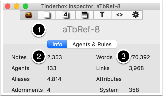
The Tinderbox inspector gives and overview of the document:
- The title is always the document name, as opposed to the selection.
- Info tab.
- Agents & Rules tab.
3.1 Tinderbox Inspector - Info tab
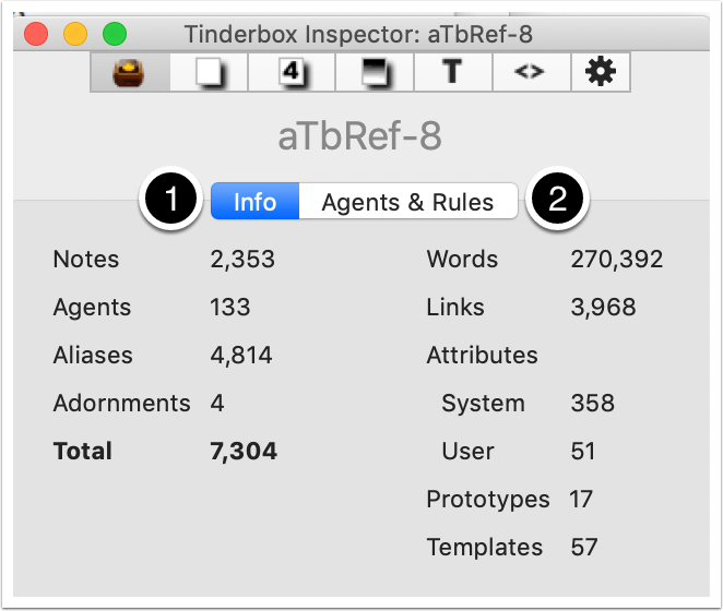
This tab gives an overview of metrics about the current (front) document.
- The left column shows the numbers of notes and other object types in the document. These are totalled at the bottom.
- The right column gives a word count and numbers of underlying structural elements like prototypes and templates.
Note for users from pre-v6: this view replaces the v5 Hypertext view.
3.2 Tinderbox Inspector - Agents & Rules tab
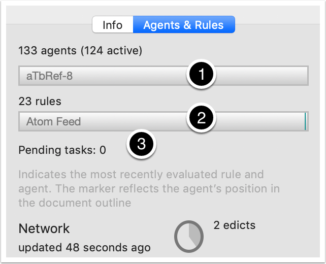
This shows performance of action code and various forms of synching.
- The number of agents. The vertical green bar (seen here only at the right end of the second bar) moves from left to right each agent update cycle giving an indication of how much work is having to be done. The name shown in the bar is the agent being processed currently. This makes it easy to see very slow-running agents.
- The number of rules. As for the agent, a sweeping progress line is shown for the rule cycle and the rule currently being run.
- The pending figure shows—at the beginning of the cycle—the number of tasks (queries, rules, etc.) to be run and counts down as the agent cycle progresses
- This shows any synching that is in use and its status. This process covers AutoFetch, watched folders, DEVONThink watched groups, geocaching updates, Simplenote synch, Bookends import updates, and other periodic maintenance. The processes described start as the progress reaches the 12:00 position (top centre). Beneath is shown how recently they were updated.
- This indicates the number of edicts in use.

4. Document Inspector
This Inspector controls a number of document level settings and defaults:
- The name of the current document. Here, shown as 'untitled' because the document had yet to be saved.
- System tab.
- User tab.
- Colors tab.
- Links tab.
- Stamps tab.
Note for users from pre-v6: this view replaces the Attributes palette.
4.1 Document Inspector - System tab
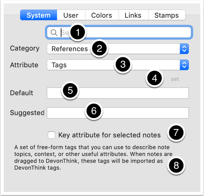
This tab lists all the current document's System (built-in) attributes:
- Search for a particular attribute. Start typing an attribute name and a selection of auto-complete possible matches are offered in a popup below the box. This is useful if the attribute name is known but not its grouping (category). Selecting a match here sets the next two pop-ups.
- Category. The name of the (under-the-hood) attribute grouping to which the attribute belongs. These categories generally pull together attributes related to a particular purpose or part of the UI. Click to open a pop-up listing of groups.
- Attribute. Click to show a pop-up list of attributes for the selected Category/group (above). Read-only attributes are listed in italics.
- The selected attribute's Tinderbox data type, e.g. string, number, list, etc. Here it is a 'set'.
- Default. The default value for the selected attribute. For all but read-only attributes, the doc level default value (inherited by all notes) can be edited here.
- Suggested. A box for suggested values. Enter an optional list (semi-colon delimited) of suggested attribute values which pre-populates the pop-up list of values in the Get Info/Attributes dialog and Key Attribute tables.
- This is ticked if this attribute is used as a Key Attribute by the currently selected note(s). This can be used to set/unset Key Attributes, although main text pane pop-up or Get Info are better tools for this task.
- A short description of the purpose of the attribute.
4.2 Document Inspector - User tab
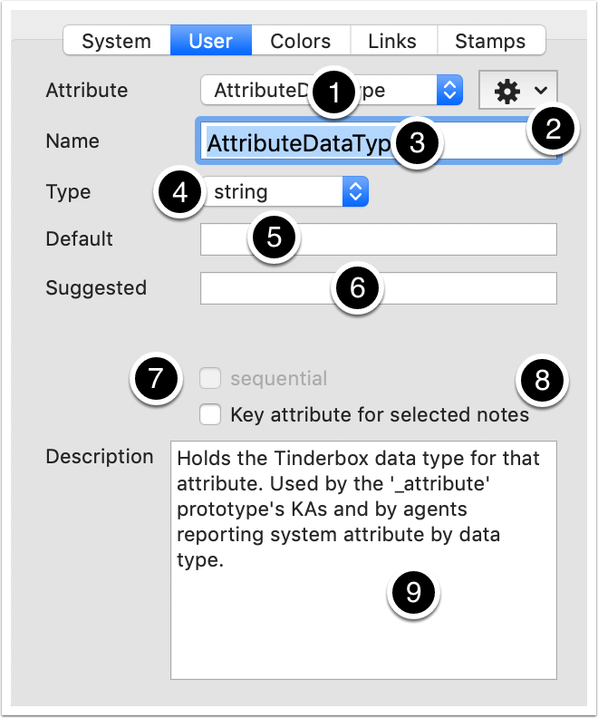
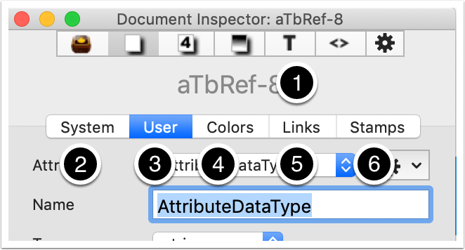
This tab lists all the current document's (custom) User attributes. It can be used to add/delete user attributes and make some edits to their configuration:
- A pop-up of existing user attributes for the current document - here a specimen string-type attribute 'MyString' has already been added.
- Click this gear-wheel button for a drop-down menu with options to either add a new attribute or to delete the currently selected one.
- Name. The name of the selected attribute. The box may initially be empty until the first user attribute is added. Use the Return key to finish editing or click outside the box (or the Escape key to exit with no edit).
- Type. A pop-up list sets the Tinderbox data-type for the attribute. It should not generally be changed once the attribute is defined.
- Default. Give the attribute a document level default, or leave blank to use the app default for the given attribute data type (e.g. zero for Number, nothing for string, 'never' for Date, etc.)
- Suggested. A box for suggested values. Enter an optional list (semi-colon delimited) of suggested attribute values which pre-populates the pop-up list of values in the Get Info/Attributes dialog and Key Attribute tables.
- sequential. Only used by Number-type attributes. If ticked, each existing note receives a sequential value in $OutlineOrder order and thereafter new notes in the order they are added.
- This is ticked if this attribute is used as a Key Attribute by the currently selected note(s). This can be used to set/unset Key Attributes, although main text pane pop-up or Get Info are better tools for this task.
- Description. Optionally provide a textual description for the need/purpose of the attribute. The description is only displayed in this location.
4.3 Document Inspector - Colors tab
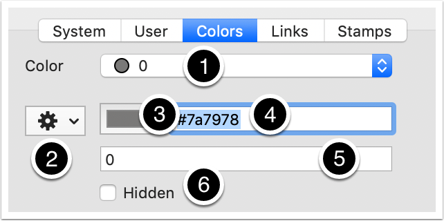
This tab is used for configuring/editing defined (named) colours in the current document. In addition to the v5 named colours ('red', etc.) v6 defines ten shades of grey 0 through 9. N.B the actual values of all/some named colours may be redefined by use of colour palette applied via the Document Settings 'Colors' tab or via drag/drop of a colour scheme file onto a TBX. Controls are:
- A pop-up list of all currently named/defined colours, both built-in and user-added. The little circle shows the actual colour defined, before listing the defined colour's name.
- A pop-up control to add new colours or delete existing ones, or save a colour scheme (TBC) file.
- The colour chip opens the Mac's OS colours palette to set a colour or the value can be defined via the input box.
- The hexadecimal value of the colour.
- The Tinderbox name for the new/currently selected colour (note that numerals are allowed and names may be more than one word, e.g. 'burnt umber')
- Tick this box to hide the colour from pop-up lists of defined colours elsewhere in Tinderbox. The colour may still be used in actions and in attribute values, it is simply not listed.
4.4 Document Inspector - Links tab
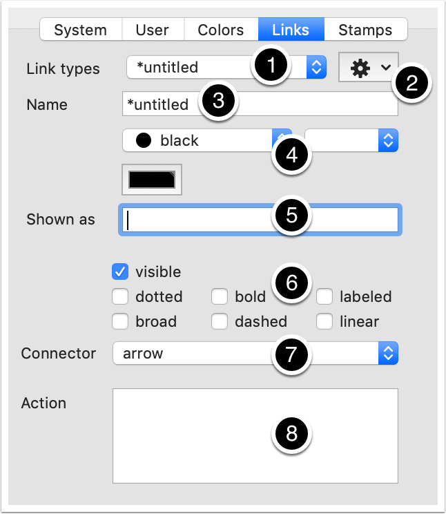
This tab lists and defines link types in the current document:
- Link types. A pop-up list of currently defined link types (regardless of whether used at present or not). Information for the selected item is shown in the rest of the pane.
- A control with options to add a new link type, delete the current link type, or delete all unused link types within the present document.
- Name. The name of the currently selected link type.
- An OS colour control to change the colour of the links drawn with the selected link type.
- Shown as. The displayed (on map links) name of the currently selected link type. New to v6, a link type's on-screen label name differ from the internal name. This can help for using longer screen labels or if needing characters that are problematic for action code use, e.g. where filtering links by link type name where the internal name is used as opposed to the screen label
- Tick-box controls to alter how the selected link type is drawn on maps.
- visible. If ticked (default), the currently selected link type is drawn on maps. Un-tick to hide this link type.
- dotted. If ticked (default is un-ticked), the currently selected link type's link lines are drawn as dotted lines instead of solid. Dotted and dashed stylings can be be ticked to give a dot-dash line style.
- broad. If ticked bezier links are to be drawn in the broad style.
- bold. If ticked (default is un-ticked), the currently selected link type's link line is drawn bolded (i.e. wider line width).
- dashed. If ticked (default is un-ticked), the currently selected link type's link lines are drawn as dashed lines instead of solid. Dotted and dashed stylings can be be ticked to give a dot-dash line style.
- labeled. If ticked (default - except for '*untitled'), the currently selected link type's links are drawn with a label. The label is the name (#2 above) unless a custom screen label is defined (#3 above).
- linear. If ticked (default is un-ticked), the currently selected link type 's link lines are drawn as straight lines instead of the normal bezier curves.
- Connector. Choose a connector type: arrow (default) or circle.
- Action. LinkTypes can define an optional OnLink action that will be performed whenever a new link of that type is created.
4.5 Document Inspector - Stamps tab
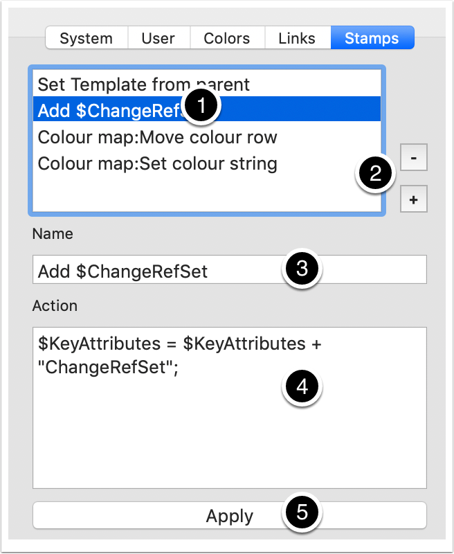
This tab allows creation, configuration and use of stamps in the current document:
- A list of currently saved stamps - here a specimen item has already been added.
- Controls to delete the currently selected list item, or to add a new stamp.
- Name. Add/edit a stamps' name.
- Add/edit the stamp's code.
- Apply. Click the button to apply the stamp to the currently selected note(s). This an alternative to using the main Stamps menu.

5. Properties Inspector
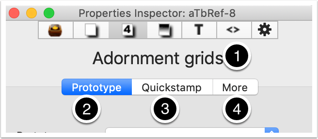
This Inspector holds a number of miscellaneous controls for notes:
- The title is always note-related. The title shows either the title of the currently selected note or, if more than one note is selected, the total number of notes currently selected - e.g. '4 notes'.
- Prototype tab.
- Quickstamp tab.
- More tab.
The Properties Inspector is opened/closed from the Window menu or via the keyboard shortcut ⌘+3 (this opens with the Prototype tab selected)
Note for users from pre-v6: the first and last tabs hold items from the Create/Rename dialogs and the second tab is similar to the v5 Quickstamp Inspector.
5.1 The Properties Inspector - Prototype tab
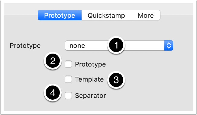
This tab holds controls a number of note-related general configuration settings:
- Prototype. A pop-up shows the currently selected prototype assigned ($Prototype) if any. The list shows all prototypes currently defined for the document. The selection choice sets/changes/removes a prototype assignment.
- Prototype. Tick to make the note a prototype ($IsPrototype).
- Template. Tick to make the note an export template ($IsTemplate).
- Separator. Tick to make the note a separator ($Separator). Separators are only visible in Outline view.
5.2 Properties Inspector - Quickstamp tab
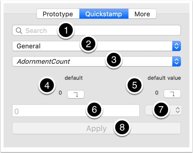
This tab offers a quick way to set a value for an attribute for the selected note(s), or ro re-assert inheritance of values:
- Quick search box with auto-complete to find attributes. Selecting a match here sets the next two pop-ups.
- The name of the (under-the-hood) attribute grouping to which the attribute belongs. These categories generally pull together attributes related to a particular purpose or part of the UI. Click to open a pop-up listing of groups.
- Click to show a pop-up list of attributes for the selected Category/group (above). Read-only attributes are listed in italics.
- Inherited value, or 'default' if no prototype set. The value string shown is the value to be inherited if different from the local value. Click the button to apply this value/inheritance to the current selection.
- Value assigned (locally) to this note, or 'default value' if no prototype set. The value string shown is the value to be inherited if different from the local value. Click the button to apply this value/inheritance to the current selection.
- An input box to set a local value for the selected attribute for the current note selection.
- Existing value pop-up list. If the selected attribute is of String, List or Set data type, this pop-up shows existing unique values for the attribute
- Apply. Click the button to apply the displayed settings.
5.3 The Properties Inspector - More tab
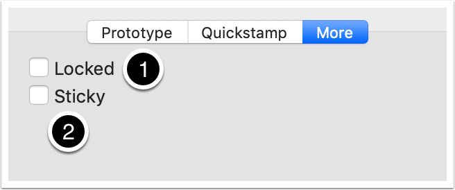
This tab holds two map-related controls:
- Toggled the locked state ($Lock) of the selected items.
- Toggle the sticky state ($Sticky) of the selected items.

6. Appearance Inspector
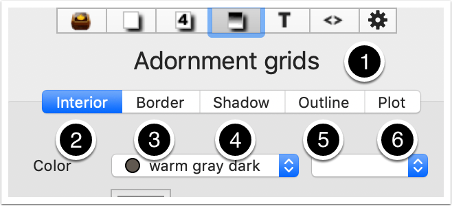
This Inspector holds controls for adjusting the appearance of notes:
- The title is always note-related. The title shows either the title of the currently selected note or, if more than one note is selected, the total number of notes currently selected - e.g. '4 notes'.
- Interior tab.
- Border tab.
- Shadow tab.
- Outline tab.
- Plot tab.
Note for users from pre-v6: this view replaces much of the v5 Inspector (an exception is Quickstamp, which is in the v6+ Properties inspector, see above).
6.1 Appearance Inspector - Interior tab
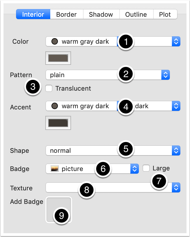
This tab controls a number of the most commonly used appearance-related aspects of notes:
- Color. Tinderbox color controls to set $Color. In Outline/Chart views this is the colour of the item's title. In Map view it is the main colour of the map icon for the note.
- Pattern. Sets $Pattern, though only for named values and not for calculated forms as used for container plots. Patterns are drawn using $Color and $Color2.
- Translucent. If ticked, the note's Map view $Opacity is set to 50(%). N.B. these are not the only allowed values for the atribute.
- Accent. Tinderbox color controls to set $Color2. In Map view it is the secondary, 'accent', colour of the map icon for the note used for patterns, progress bars and the like.
- Shape. Sets the shape of the note's Map view icon, stored in $Shape.
- Badge. Sets the note's badge ($Badge).
- Large (tick box). When ticked a display box of 64x64 pixels is used instead of the default 32x32.
- Texture. Sets the note's Map view icon's texture fill ($Fill). If a texture is used then $Pattern and $Colour are not seen.
- Add Badge. An image well accepts a drag-drop of a bitmap image as a custom badge.
6.2 Appearance Inspector - Border tab
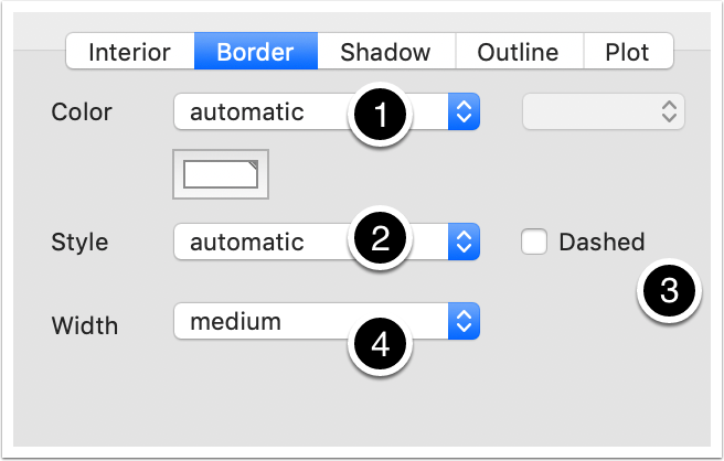
This tab controls the appearance of the Map view border of notes:
- Color. Tinderbox color controls to set $BorderColor. In Outline/Chart views this is the colour of the item's title. In Map view it is the main colour of the map icon for the note.
- Style. Sets the style of the border edge ($BorderBevel).
- Dashed. If ticked and the border style is 'plain', the map icon is drawn with a dashed border ($BorderDash is set to '5', or '0' when not ticked). N.B. these are not the only allowed values for the attribute.
- Width. Sets the border width if a border is shown ($Border).
6.3 Appearance Inspector - Shadow tab
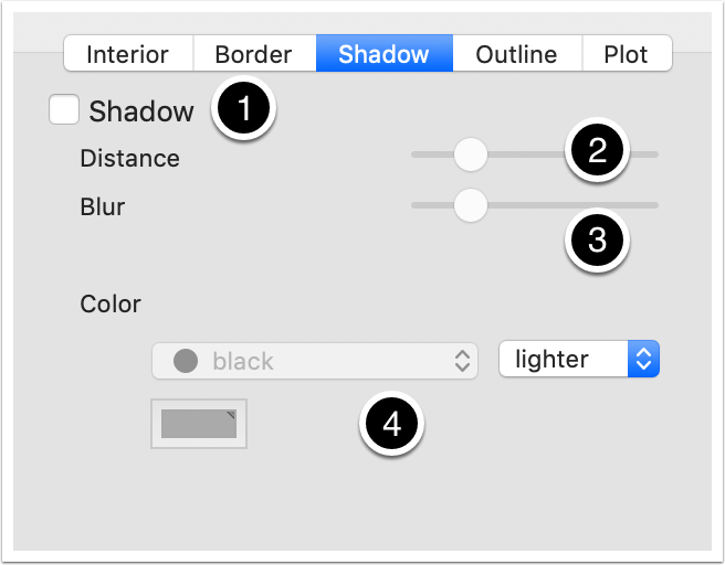
This tab controls whether Map view icons show a drop shadow:
- Shadow. If ticked, map icons are drawn with a drop shadow ($Shadow).
- Distance. The distance a drop shadow is drawn from its source note ($ShadowDistance).
- Blur. The degree of blur in the drop shadow ($ShadowBlur).
- Color. Tinderbox color controls to set $ShadowColor. In Map view it is the colour used to draw the note's drop shadow.
6.4 Appearance Inspector - Outline tab
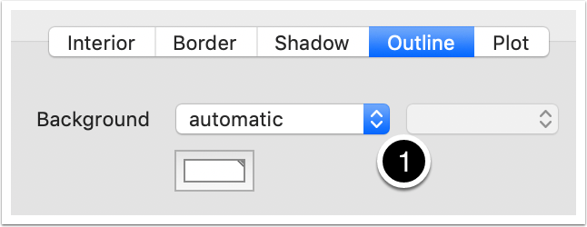
This tab controls the background colour of Outline views:
- Background. Tinderbox color controls to set the colour of the Outline view background for the current view ($OutlineBackgroundColor).
6.5 Appearance Inspector - Plot tab
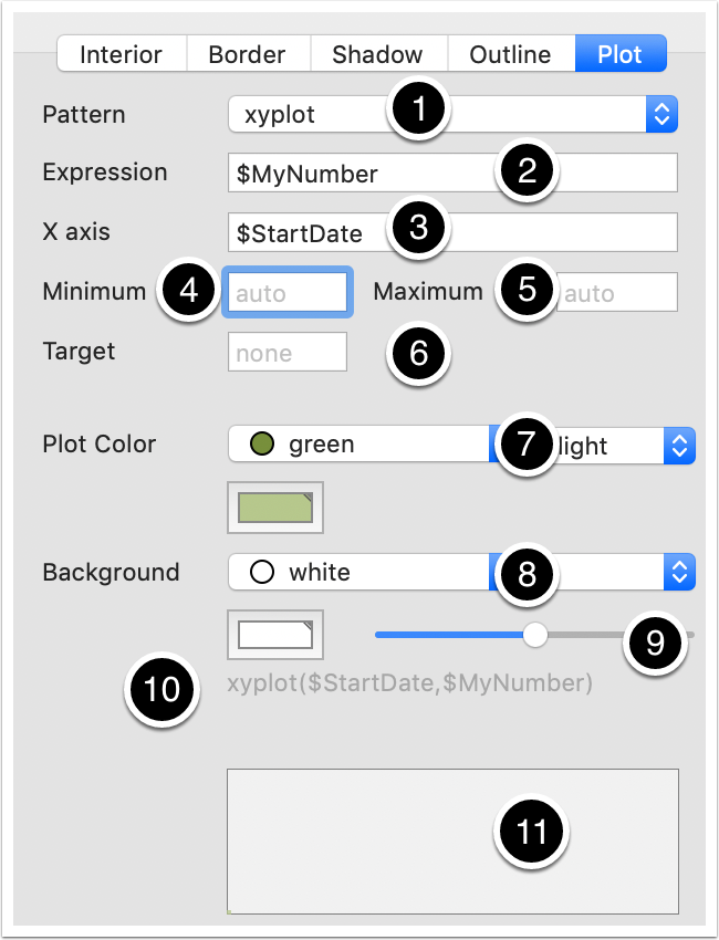
This tab controls various aspects of a Map view's container plots. Not all inputs/controls are visible - it depends on the plot type (pattern) that is specified.
- Pattern. The type of container plot expression.
- Expression. The container plot expression (code).
- X axis. Optional input for the xyplot() expression.
- Minimum. Optional maximum value for the Y axis.
- Maximum. Optional maximum value for the Y axis.
- Target. Displayed on a new line between Minimum/Maximum and Plot Color, when the Pattern type is bar() or vbar().
- Plot Color. Tinderbox color controls to set the colour of the plotted data in a container plot ($PlotColor).
- Background. Tinderbox color controls to set the colour of the container plot background for this note's Map ($PlotBackgroundColor).
- Background opacity. A slider is used to set the opacity of the plot's background - if transparent, the child map shows through ($PlotBackgroundOpacity).
- Currently defined plot pattern string ($Pattern). To edit use the settings above.
- Preview window. A preview image of the above settings as a plot.

7. Text Inspector
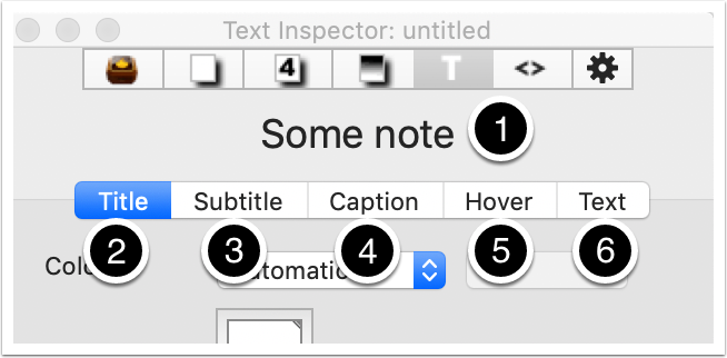
This Inspector controls a number of note level settings relating to text appearance:
- The name of the current document.
- Title tab.
- Subtitle tab.
- Caption tab.
- Hover tab.
- Text tab.
Note for users from pre-v6: this view replaces and extends the features of the v5 Inspector's Text tab.
7.1 Text Inspector - Title tab
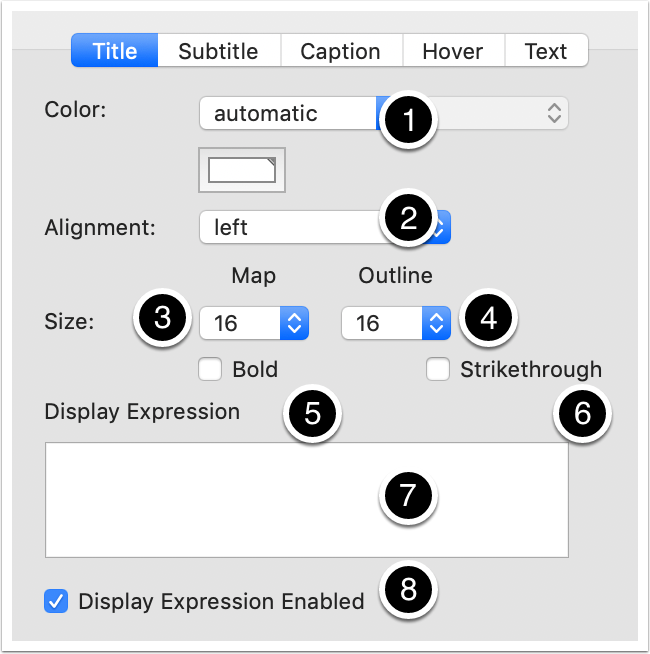
This tab controls how the current note's title appears:
- Color. Tinderbox color controls to set the colour of the title in Map icons ($NameColor, maps only).
- Alignment. The horizontal alignment of titles in map icons ($NameAlignment).
- Size (Map). Sets the relative size of the Map icon title ($MapTextSize); subtitle & body text are scaled appropriately.
- Size (Outline). Sets the relative size of the Outline/Chart title ($OutlineTextSize);
- Bold. Sets the title to bold text in all views ($NameBold).
- Strikethrough. Sets the title's text style to strikethrough in all views ($NameStrike).
- Display Expression. Input box for a display expression; the input is the action code to be evaluated ($DisplayExpression). The output of the expression is $DisplayName; if $DisplayName has a value, it is used instead of $Name in all main view titles (but not in the text pane header title).
- Display Expression Enabled. The tick box allows control over whether the current display expression is evaluated or not ($DisplayExpressionDisabled).
7.2 Text Inspector - Subtitle tab
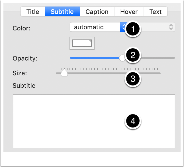
This tab controls how the current note's subtitle appears (used in Map views only):
- Color. Tinderbox color controls to set the colour of the subtitle text Map icons ($SubtitleColor).
- Opacity. The opacity with which the subtitle is drawn ($SubtitleOpacity).
- Size. The relative size of the subtitle's text compared to the note's title ($SubtitleSize).
- Subtitle. The input box holds the subtitle's text - this is not an evaluated expression ($Subtitle).
7.3 Text Inspector - Caption tab
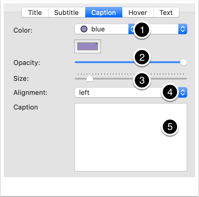
This tab controls how the current note's caption appears (used in Map views only):
- Color. Tinderbox color controls to set the colour of the subtitle text Map icons ($CaptionColor).
- Opacity. The opacity with which the caption is drawn ($SubtitleOpacity).
- Size. The relative size of the caption's text compared to the note's title ($SubtitleSize).
- Alignment. The horizontal alignment of caption beneath Map icons ($CaptionAlignment).
- Subtitle. The input box holds the caption's text - this is not an evaluated expression ($Caption).
7.4 Text Inspector - Hover tab
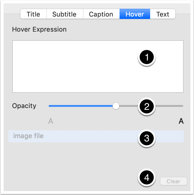
This tab sets the current note's hover expression. Hover expressions are intended mainly for Map views, but also display in Outline and chart views. The hover expression is shown when the cursor is over a note; the note does not have to be selected to show the expression.
- Hover Expression. Input box for a hover expression; the input is the action code to be evaluated ($HoverExpression).
- Opacity. This slider alters the note's opacity ($HoverOpacity).
- [image file]. Drop a bitmap image here to set an image background ($HoverImage). If used, a preview of the image is displayed.
- Clear. Button is only enabled if a $HoverImage is set. Click to clear the existing image.
7.5 Text Inspector - Text tab
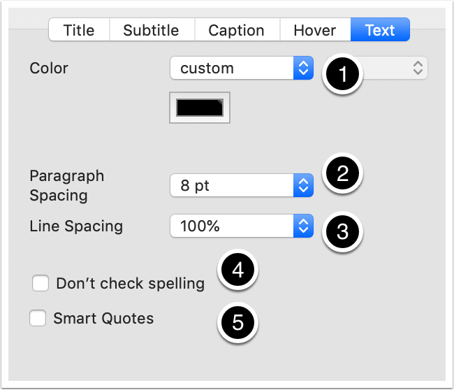
This tab controls a number of features relating to the current note's text:
- Color. Tinderbox color controls to set the colour of the subtitle text Map icons ($TextColor).
- Paragraph Spacing. Set the spacing of paragraphs within the current note ($ParagraphSpacing).
- Line Spacing. Set the line spacing within the current note ($LineSpacing).
- Don't check spelling. Tick to turn-off doc-level preferences to spell-check documents ($NoSpelling); essentially a local override.
- Smart Quotes. Tick to turn-off doc-level preferences to automatically change straight quotes to typographic, i.e. 'curly', quotes. ($SmartQuotes); useful if putting code into note $Text.

8. HTML Inspector
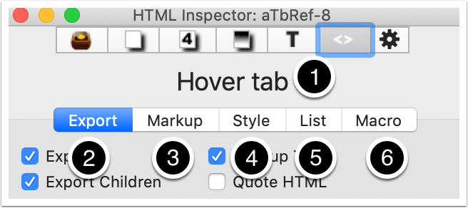
This Inspector controls a number of note level settings relating to formatted ex[ort of data (not just HTML):
- The name of the current note.
- Export tab.
- Markup tab.
- Style tab.
- List tab.
- Macro tab.
Note for users from pre-v6: this view replaces the HTML Inspector.
8.1 HTML Inspector - Export tab
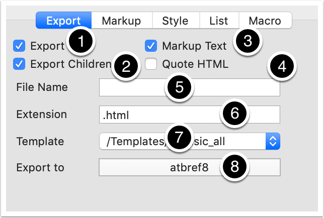
This tab controls a number of features relating to exporting the current note:
- Export. Tick to ensure this note is exported during an export of the document ($HTMLDontExport).
- Export Children. Tick to export child notes even if this note is not exported ($HTMLExportChildren).
- Markup Text. Evaluate an ^export^ code in the note, including smart lists and automatic headings ($HTMLMarkupText).
- Quote HTML. If ticked any inline HTML code will be escaped, i.e. so it applies as test in HTML rather than getting interpreted as mark-up code ($HTMLQuoteHTML).
- File Name. The filename to use for this note's exported file - leave blank to use an automatically assigned name ($HTMLExportFileName).
- Extension. The filename extension (including an initial full stop) to use for exported files ($HTMLExportExtension).
- Template. Chose an existing internal template note to act as this note's export template ($HTMLExportTemplate).
- Export to. Click to set the OS folder into which export will occur (document wide setting).
8.2 HTML Inspector - Markup tab
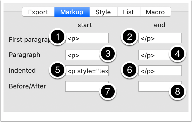
This tab controls a number of markup choices used when exporting the current note:
- First paragraph (start). Formatting to insert at the start of the first paragraph of a note's text ($HTMLFirstParagraphStart).
- First paragraph (end). Formatting to insert at the end of the first paragraph of a note's text ($HTMLFirstParagraphEnd).
- Paragraph (start). Formatting to insert at the start of the second and subsequent paragraphs of a note's text ($HTMLParagraphStart).
- Paragraph (end). Formatting to insert at the end of the second and subsequent paragraphs of a note's text ($HTMLParagraphEnd).
- Indented (start). Formatting to insert at the start of any indented paragraphs of a note's text ($HTMLIndentedParagraphStart).
- Indented (end). Formatting to insert at the end of any indented paragraphs of a note's text ($HTMLIndentedParagraphEnd).
- Before/After (start). Formatting to insert into any exported date before the start of the actual text ($HTMLBefore).
- Before/After (end). Formatting to insert into any exported date after the end of the actual text ($HTMLAfter).
8.3 HTML Inspector - Style tab
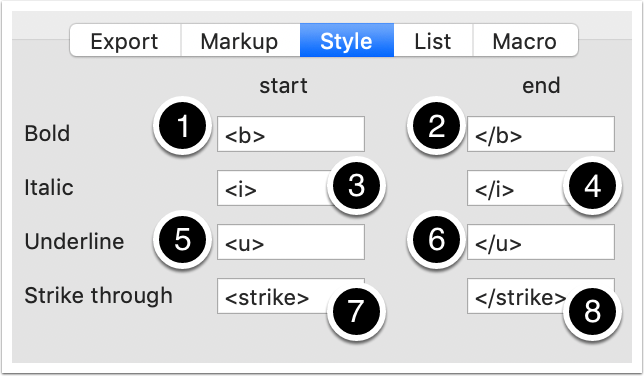
This tab controls a number of styling markup choices used when exporting the current note:
- Bold (start). Formatting to insert at the start of any run of bold text ($HTMLBoldStart).
- Bold (end). Formatting to insert at the end of any run of bold text ($HTMLBoldEnd).
- Italic (start). Formatting to insert at the start of any run of italic text ($HTMLItalicStart).
- Italic (end). Formatting to insert at the end of any run of italic text ($HTMLItalicEnd).
- Underline (start). Formatting to insert at the start of any run of underlined text ($HTMLUnderlineStart).
- Underline (end). Formatting to insert at the end of any run of underlined text ($HTMLUnderlineEnd).
- Strike through (start). Formatting to insert at the start of any run of strike-through text ($HTMLStrikeStart).
- Strike through (end). Formatting to insert at the end of any run of strike-through text ($HTMLStrikeEnd).
8.4 HTML Inspector - List tab
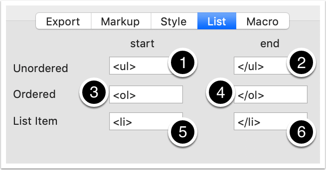
This tab controls a number of list markup choices used when exporting the current note:
- Unordered (start). Formatting to insert at the start of an unordered (bulleted) list ($HTMLListStart).
- Unordered (end). Formatting to insert at the end of an unordered (bulleted) list ($HTMLListEnd).
- Ordered (start). Formatting to insert at the start of an ordered (numbered) list ($HTMLOrderedListStart).
- Ordered (end). Formatting to insert at the end of an ordered (numbered) list ($HTMLOrderedListEnd).
- List item (start). Formatting to insert at the start of a list item ($HTMLListItemStart).
- List item (end). Formatting to insert at the end of a list item ($HTMLListItemEnd).
8.5 HTML Inspector - Macro tab
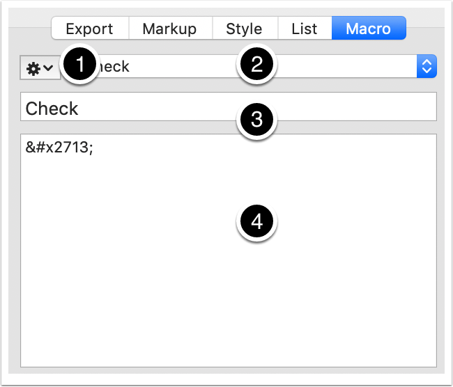
This tab allows for creation and management of export macros (with document, not note, scope):
- Pop-up control to create/delete macros.
- Pop-up list of existing macros.
- Macro name.
- Macro's code.

9. Action Inspector
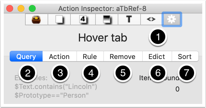
This Inspector controls a number of action code related setting for the current note:
- The name of the current note.
- Query tab.
- Action tab.
- Rule tab.
- Remove tab.
- Edict tab.
- Sort tab.
Note for users from pre-v6: this view replaces features formerly found on the Create/Rename dialogs.
9.1 Action Inspector - Query tab
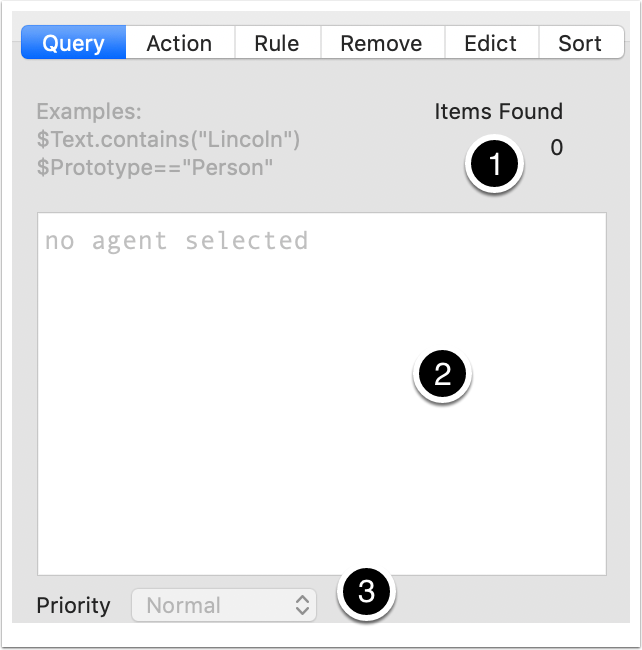
This tab controls the query for the current agent (agents only):
- Items Found. This reports the number of items currently matching the query (i.e. child aliases within the agent container).
- Query input box. Holds code used for the agent's query ($AgentQuery). To finish editing, either use the Return key or click outside the box. To exit with no edit, click the the Escape key. To create a line break in the code, click the Option+Return keys. Autocomplete is offered for attribute names.
- Priority. The pop-up sets the frequency with with the agent is run including turning the agent off altogether ($AgentPriority).
9.2 Action Inspector - Action tab
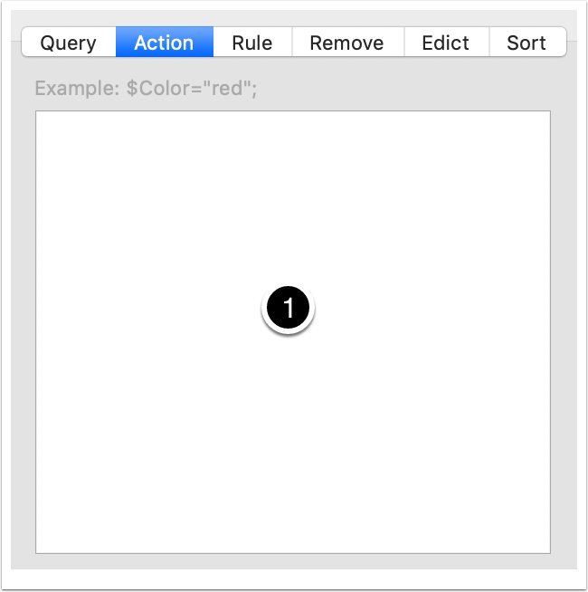
This tab controls the action the current note or agent:
- Action code input box. Holds code used for $OnAdd if the selection is a note (including smart adornments), or $AgentAction for agents. To finish editing, either use the Return key or click outside the box. To exit with no edit, click the the Escape key. To create a line break in the code, click the Option+Return keys. Autocomplete is offered for attribute names.
9.3 Action Inspector - Rule tab
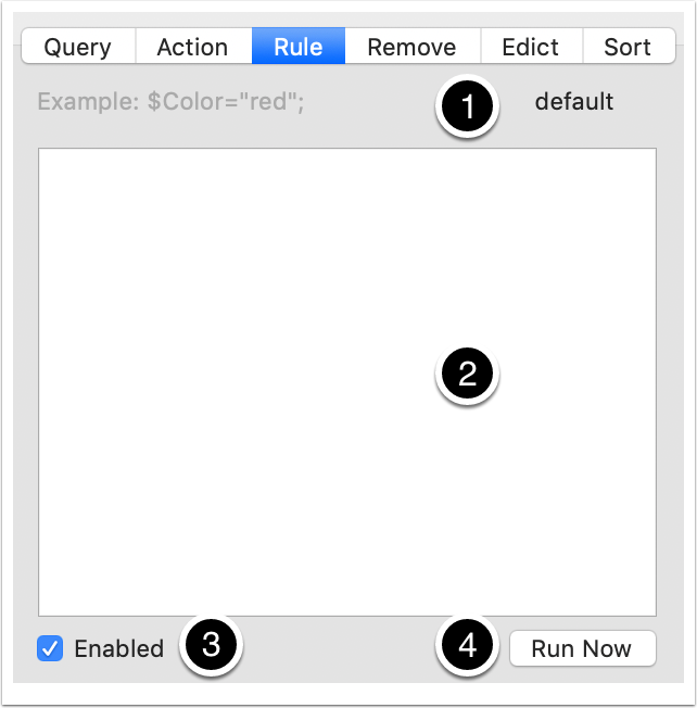
This tab controls the rule for the current note:
- Inheritance state. default (uses document default), inherited (uses an inherited (prototype) value) or no caption if the rule is set locally in the note.
- Rule code input box. Holds code used for the note's rule ($Rule). To finish editing, either use the Return key or click outside the box. To exit with no edit, click the the Escape key. To create a line break in the code, click the Option+Return keys. Autocomplete is offered for attribute names.
- Enabled. Un-tick the box to disable the rule running in this note - useful for prototypes ($RuleDisabled).
- Run Now. This button runs the rule immediately, once only, regardless of the state of the current agent/rule cycle. If the rule is disabled, this button is disabled.
9.4 Action Inspector - Remove tab
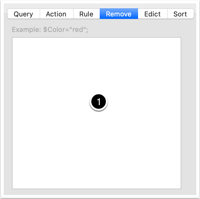
This tab controls the remove action for the current note:
- Action input box. Holds code used for $OnRemove
9.5 Action Inspector - Edict tab
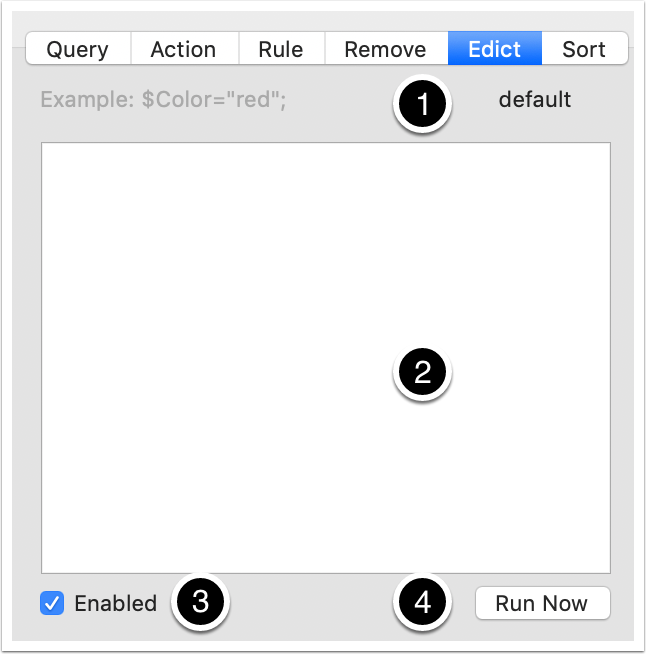
This tab controls the edict for the current note:
- Inheritance state. default (uses document default), inherited (uses an inherited (prototype) value) or no caption if the rule is set locally in the note.
- Edict code input box. Holds code used for the note's rule ($Edict). To finish editing, either use the Return key or click outside the box. To exit with no edit, click the the Escape key. To create a line break in the code, click the Option+Return keys. Autocomplete is offered for attribute names.
- Enabled. Un-tick the box to disable the rule running in this note - useful for prototypes ($EdictDisabled).
- Run Now. This button runs the edict immediately, once only, regardless of the state of the current agent/rule cycle. If the rule is disabled, this button is disabled.
9.6 Action Inspector - Sort tab
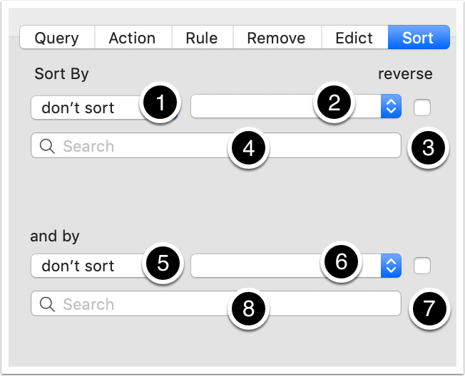
This tab controls a number of sorting choices for the current note's children (applies to agents results too):
- Sort By. Pop-up to select the primary sort attribute ($Sort).
- Pop-up to set primary sort order criterion ($SortTransform).
- reverse. Tick to reverse primary sort order ($SortBackward).
- [Search]. A search box to help select the Sort By attribute choice.
- and by. Pop-up to select the secondary sort attribute ($SortAlso).
- Pop-up to set secondary sort criterion ($SortAlsoTransform).
- reverse. Tick to reverse secondary sort order ($SortAlsoBackward).
- [Search]. A search box to help select the and by attribute choice.

10. Summary
This was prepared using v8.2.2 and reflects content in aTbRef8. Questions about how to use the Inspectors should be asked in the Tinderbox forums. Any errors encountered with Inspector controls should be reported via email to Eastgate.