This article describes how to set up data tables for containers in Tinderbox v6 or later. There is no Inspector for this feature (although Quickstamp can be used). Instead the Map view offers a pop-over for configuring the appropriate attributes.
This document was last revised using Tinderbox v8.6.2 on macOS 10.14.6.
Author: Mark Anderson (a Tinderbox user since 2004).
1. $TableExpression and $TableHeading
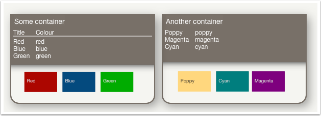
The data for the table is set via an action code expression in $TableExpression. Optional column heads are for the table are set in $TableHeading. Both table-setting attributes belong to the 'Map' group of System Attributes. The image above shows both forms of display, with the one on the left having a heading row (i.e. the text above the solid line).

2. Containers can show a table OR text (not both!)
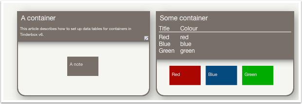
As the data table is drawn on the face of the container icon, it uses the space otherwise used for the (optional) display of the container's $Text. If a container has both $Text and a $TableExpression, the table is shown.

3. The table expression pop-over
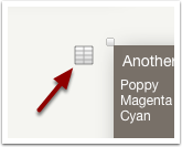
The pop-over for configuring table expressions is shown only in Map view, and only when a container (note or agent) is selected. Click the grid icon to open the pop-over.

4. Configuring a new table
Configuring a new container table from scratch.
4.1 The controls
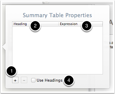
If no table is yet configured, a blank pop-over opens:
- Add/remove table data columns (which actually are rows in this pop-over)
- Optional heading (
$TableHeading) for this column. - The
$TableExpressiondata for this column. - Tick-box controlling whether table column headings are used. If un-ticked headings are suppressed even if defined in the above table.
4.2 A table with data
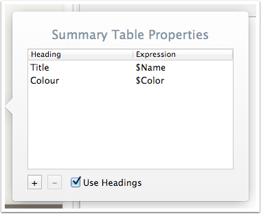
The rows shown are drawn as columns. Row #1 is column #1, etc., with the columns ordered left to right. If set (or viewed by other means) $TableHeading is the contents of all of column #1 in the pop-up and $TableExpression the contents of all of column #2.
4.3 Basic table layout
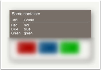
The settings in the last step look like this. Ignore the (lower) viewport section of the container for now as this is not affected by the table. Note that as 'Use Headings' has been set, the headings are drawn above the table, divided from it by a ruler.
4.4 Styling table text
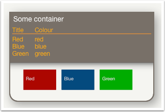
By default, the table is drawn in $NameColor (the colour used for the title) or in $MapBodyTextColor, if the latter is set. The font size for the table uses $MapBodyTextSize. The table is drawn in $NameFont, i.e. that used by the container title ($Name).
N.B. Font styling of table text is different from display of $Text in the titlebar, with uses $TextFont (or any font face, e.g. bold/italic but not size/colour)
4.5 Ensuring sufficient vertical space
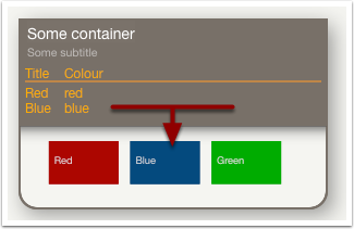
A container with a table can also have a subtitle, but note that if added after the table is set up, you may need to drag the title section of the container icon a bit deeper to reveal now-hidden content. This demonstrates that the app doesn't adjust the height for you (in case that was assumed). Note that the height of the top part of the overal icon (or bottom part if an agent) is stored in $TitleHeight, which can edited manually or via action code.
4.6 Column headings are optional
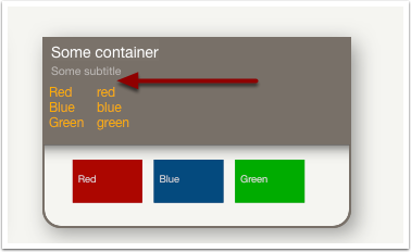
Even if there is $TableHeading data, the 'Use Heading' tick-box can be used to suppress the heading row, as shown above.
4.7 Setting up headings
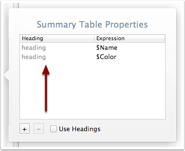
If no heading data is added, the tick-box is disabled. If ticked and the pop-up closed, the tick-box is un-ticked when the pop-over is re-opened. There must be heading data to use the headings feature.
Heading values are always an unquoted literal string such as Title or Price (if quotes are used, they will be rendered in the heading caption). Attribute reference cannot be used. If a value of $MyString is entered the heading will be the string '$MyString' rather than that attribute's value as in action code.

5. Editing the data table
How to edit the data entered into the configuration table.
5.1 Adding the first row
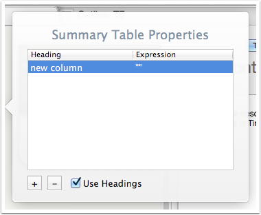
When the first row is added to a new table, notice that Tinderbox assumes headings will be used. You may either edit and remove the the default 'new column' heading or leave it in place, as un-ticking the 'Use Headings' tick box will ignore heading data when rendering the table.
5.2 Editing a cell
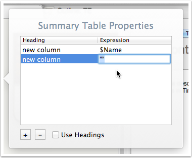
To edit the cell in either column, click-hold-release, as with putting a map icon title into edit-in-place mode. Or use the Return key and the first cell in the selected row is focused and opened for edit.
To move between columns use Tab to move right and Shift+Tab to move left.
Use the Return key (or tab to another column) to save/close a cell edit. Clicking outside the currently edited cell will also save/close the edit.
Row selection can be changed by clicking on a different row. Via keystroke, if there is not cell in edit mode ↑ and ↓ keys will move row selection up or down
5.3 Expressions can be action code
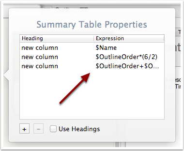
The examples so far have just used single attributes. $TableExpression is an action-type attribute and can thus use more complex action code expressions.
Calculated values are updated as part of the agent/rule update cycle and thus will automatically reflect any changes in the expression's source data.
5.4 Adding/deleting/re-ordering rows in existing data
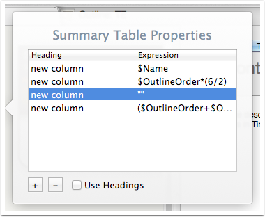
When adding new rows via the '+' button, they are added after the currently selected row. Thus, with row #2 selected, a new row is added after it as row #3.
Row order can be altered via drag-drop of the rows in the table.
To delete an existing row, use the '-' button.

6. Other methods of altering the data table
As column headings ($TableHeading) and values ($TableExpression) are stored as attributes, values can be seeded by prototype inheritance or (re-)set via stamps, rules or OnAdd actions.