This article describes the pop-over menu for configuring adornment grids, first introduced in Tinderbox v6.
This document was last revised using Tinderbox v7.5.4 on macOS 10.13.6.
Author: Mark Anderson (a Tinderbox user since 2004).
1. Locating the Grid pop-over control

The control for opening the pop-over is only shown for adornments, and then only when selected. For a selected adornment the grid control is the third icon below those for Lock and Sticky states.

2. What are grids for?

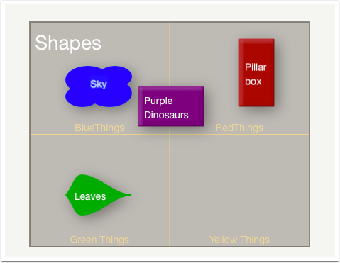
The grid can assit with manual sorting of notes. The grid has no connection with smart adornment use and grid cells can't use a query to decide what is placed upon them. See that notes don't have to sit within a cell. Cell labels are optional and do not necessarily need to reflect the purpose of the cell. The colour used to draw the cell grid and/or the grid's opacity can be configured so as to lessen contrast. Optional cell labels also offer control over the font used for the label and the label point size. All these grid controls affect the whole grid, i.e. the label font must be the same for all cells.

3. Opening the Grid pop-over

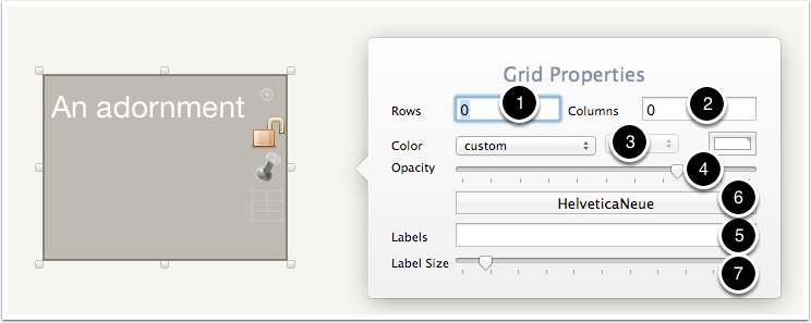
The pop-over appears to the right of the selected adornment. The pop-over features a number of controls:
- The number of rows in the grid. Set/stored as $GridRows: default value is 0.
- The number of columns in the grid. Set/stored as $GridColumns: default value is 0.
- Standard colour control set for the colour of grid markings. Set/stored as $GridColor: default value is #ffffff (white).
- Slider control to set the opacity of the grid markings. Set/stored as $GridOpacity: default value is 75.
- Labels: a semi-colon-delimited list of optional grid cell labels. Set/stored as $GridLabels: default value is "" (no string - empty list).
- The font to use for grid labels. Set/stored as $GridLabelFont: default value is HelveticaNeue.
- The font size to use for grid labels. Set/stored as $GridLabelSize: default value is 10.

4. Grid - rows

Use the Rows input box to set the number of grid rows. Set to zero for no rows. The grid is updated automatically. Here, settings are for 2 rows.

5. Grid - columns

Use the Columns input box to set the number of grid columns. Set to zero for no columns. The grid is updated automatically. Here, settings are for 2 columns.

6. Grid - rows & columns

A grid of 3 rows and 2 columns.

7. Grid - colour

A colour can be used to give more contrast.

8. Grid - opacity

Dialling down the opacity can make the grid much less visible.

9. Grid - labels

Labels are set in tinderbox list-style, i.e. as a semi-colon-delimited list. Notice that by including blank list items is it possible to label only some grid cells. The list order is row left to right, then next row, etc.

10. Grid - font

Changing the font is another means of giving more clarity.

11. Grid - label size

Another method to make labels more prominent is to alter their font size.

12. Summary
It is unlikely you will need to set all these grid attributes in the same container. However, they offer a range of adjustments to suit different needs.