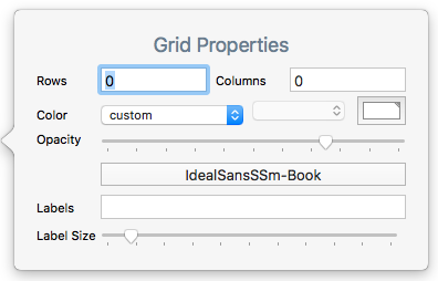
This pop-over is used to set up an optional grid layout on map adornments. It is opened by clicking the 2x3 grid icon on a selected adornment.
- Rows. The desired number of grid rows. Stored in $GridRows.
- Columns. The desired number of grid columns. Stored in $GridColumns.
- colour controls. Sets the colour used to draw the grid and its optional labels. Stored in $GridColor.
- Opacity. Controls the opacity used to drawn the grid. Stored in $GridOpacity.
- font control. Sets the font used to draw grid labels. Stored in $GridLabelFont.
- Labels. A list-type list of row and column labels. Stored in $GridLabels.
- Label size. Sets the (point) size at which labels are drawn. Stored in $GridLabelSize.
Labels are drawn, centred, at the bottom of each grid cell. Labels are read by row, then column. Thus in a 2-row 3-column grid, the first 3 labels in the list are the labels for all 3 columns of row #1, and so on. By entering an empty list item using 2 consecutive semi-colons in the list, i.e. ';;', specific cells may be left un-labelled.
If only rows or columns are set and the other value is left at zero a single row or column is drawn, i.e. a value of 1 is assumed and drawn though not set in the relevant attribute (which remains at '0').
