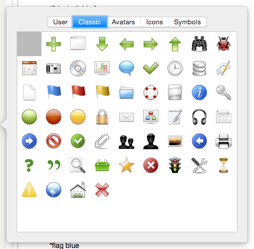
Called from the badge control of main view note icons, this picker gives a visual picker for available badges. The badge selection is stored, via its string name, in $Badge.
The range of badges shown depends on the built-in sets and any added by the user. The pickers tabs are (left to right):
- User. Any custom badge artwork placed directly into the 'badges' folder within Tinderbox's application support folder.
- Classic. The primary set of badges (default tab selection)
- Avatars. Built-in set.
- Icons. Built-in set.
- Symbols. Built-in set.
- User folders… Any discrete folders of custom badges placed into the 'badges' folder within Tinderbox's application support folder. The tab name is the folder name.
Click on any badge to set the note's $Badge. Clicking the first (blank) tile in any set resets the Badge to the default inherited state.
Place the mouse cursor over any icon, without clicking, and after a brief pause the icon's name is shown as a tool-tip. Names are case-sensitive and all built-in badges use all-lowercase.
To close the pop-over click anywhere outside it.
The Badge Picker adopts the prevailing background colour in dark mode. Monochrome icon families are drawn in white over a dark background, and in black over a light background; colour families are drawn normally.
