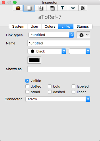
This tab allows management of the names and styling of the link types defined for the current document. Link types can be added, deleted or their settings edited.
Link types. This pop-up menu shows the 11 link types defined for all new documents, as amended by any edits/additions/deletions made by the user.
Name. This shows the name of the currently selected Link Type. The name can be changed.
(Link Color). There are 3 'standard' colour controls that set $Color:
- Defined colour list pop-up menu.
- Colour shade pop-up menu.
- Custom colour picker chip. Shows the colour used to draw this type of link line (and link labels) in map view. The default is black but can be customised per-link type
Gear wheel button (at right - moved here in v7.2.0):
- Delete "[link type]". Deletes the named link type, which is the type currently selected. Some link types are required by Tinderbox (e.g.*untitled, prototype, note, note+) and cannot be deleted; if selected this menu option is greyed out.
- Delete all unused link types. Deletes all link types (bar required ones) which do not have a least one link of that type defined in the current document.
- New link type. Adds a new link type to the list. All three boxes Link types, Name and Shown as will show a default value of 'new link'. Edit either/both of the latter two to the desires title(s) and change to colour and tick-boxes as required. Note: the value 'text' is used internally and so cannot be used a custom link type name.
Shown as. This is an alternative screen label for the link type's Name. If using link types in action code, it can be useful to have short simple names for labels that would otherwise be long or use accents, etc., that might be troublesome in code context.
- Tick boxes:
- visible tick-box (default = ticked). This indicates whether this Link Type is to be shown in Map views.
- bold tick-box (default = un-ticked). This indicates whether links of this Link Type is are drawn in bold in Map views.
- labeled tick-box (default = ticked). This toggles the visibility of the text label for the currently selected Link Type in Map views.
- dotted tick-box (default = un-ticked). This indicates whether links of this Link Type is are drawn as dotted lines in Map views.Note that ticking both dotted and dashed boxes gives a dot-dash line type.
- dashed tick-box (default = un-ticked). This indicates whether links of this Link Type is are drawn as dashed lines in Map views. Note that ticking both dotted and dashed boxes gives a dot-dash line type.
- linear tick-box (default = un-ticked). This indicates whether links of this Link Type is are drawn as straight lines in Map views. This setting trumps the 'broad' setting.
- broad tick box (default un-ticked). This setting indicates if bezier links are to be drawn in the broad style.
- Connector. Link types (and the Link Type Inspector) let you choose a connector type: arrow (default) or circle. New links of a given type adopt the type’s connector, and you can override the connector type for individual links as before. Link types record the preferred connector type, and links will use the corresponding connector unless individually overridden.
Individual links show the styling inherited for their given link type, but can be further customised using a note's Browse Links dialog.
