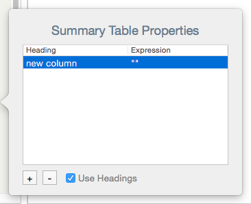
Used only in Map view, this pop-over is opened via icon displayed to the left of container notes (including agents) when selected. This approach makes it easier to correctly set the two attributes controlling container table displays.
The properties table has two columns, one for the $TableHeading component and one for $TableExpression. Each row in the properties table represents a column in the actual table display. Add as many rows as the table needs columns, using the +/- buttons to add/remove rows.
Use Headings. If un-ticked, the Headings column is suppressed and only $TableExpression components are defined.
$TableHeading is set to the aggregate of the rows in the first column, and $TableExpression uses those from the second.
To alter the order of display columns, click-hold-drag the relevant row up or down in the Properties table into the correct new location.
