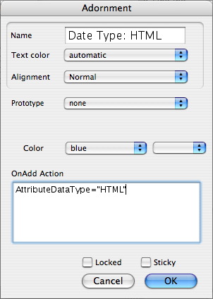
This allows you to edit setting for existing adornments in Map views. The dialog has the following settings:
- Name. This is also the visual caption used on the adornment. To 'hide' the text caption set the text color to the same as the 'Color' setting (below). To use a text caption with no visible adornment color/boundary set the 'color' property (below) to 'transparent'.
- Text color. This is the color of the adornment's text caption. Default value is 'normal' which for a default body color is white text , or black if the adornment body is set to transparent. Note, the color qualifiers come before the color when used as a color name in actions, etc.; select 'blue' + 'lighter' but refer to it as 'lighter blue'.
- Alignment. Settings offered are:
- Normal (default). Usually resolves as 'left'.
- Left.
- Center.
- Right.
- Prototype. The prototype note on which to base the initial attributes of new notes created on or dragged onto the adornment.
- Color. This is the color of the adornment area itself. Default value is 'normal'; this resolves to a grey fill and 2-pixel black border.
- OnAdd Action. Action code to perform on any new notes created in or moved to the adornment - i.e. it affects any note on top of the adornment (but not the adornment itself). This code is applied every time agents are updated. The code is stored in the OnAdd attribute.
- Locked. If ticked, the adornment cannot be moved without clearing this setting. This can be useful when reorganising a map so the adornment is not accidentally shifted. Default is un-ticked.
- Sticky. If ticked, moving the adornment also moves the notes behind which it sits. this saves you the trouble of moving an adornment and then having to re-position the notes on top of them. Default is un-ticked.
Atypically, this dialog cannot be called from any of the main menus, but only from a Map view's pop-up menu. |
 |


